Wednesday 30 January 2013

presentation

i have been working more on my presentation and have come to what i think is a good result. i have played more with the animations and chosen music which i think reflects my theme and allows easy animations. here are the sketchbook pages i have created to explain why i have chosen each slide and animation:


Tuesday 29 January 2013

presentation

ive been working on my powerpoint presentation. i have been trying to experiment with different animations and transitions to try make an interesting presentation. i am re-watching and re-watching my presentation to try to make improvements. i want to try to make the presentation as entertaining to watch as possible. part of this will be the music i choose to accompany the powerpoint. i need to find something which has a good beat, something which will be easy to time my animations to.

Sunday 27 January 2013

customer profile

i have been trying to find images which i feel reflect my theme and customer, i am wanting to create a bohemian, relaxed, romantic feel through my collection so have created this customer profile.


 i am also trying to figure out which fabrics would be best suited to my collection and am in the process of ordering some samples to help me decide. i am thinking chiffons, lace and lightweight cottons.

Saturday 26 January 2013

experimenting

i have been trying to find an image that reflects what i want my upcoming collection to portray. i have started experimenting with sketching and photoshop to create the look i want, here is one of the images i have come up with:

im not sure this is the image to reflect my collection, but i will continue to experiment with these techniques to come up with a more successful look.


Friday 25 January 2013

colour

i have been trying to create a colour palette which reflected my theme and would allow the designs to portray my theme 'Bohemian nature'. i have decided to go for muted tones, reflecting nature. i found images of lavender, so thought that colour would fit in well with my inspiration photos. i also decided muted pinks and greens would fit well. i also want my colour palette to be based around white, a fresh, crisp look which i feel reflects the summer season.
i also have been experimenting with different ways to display colour palettes, here i have used eyeshadow pots and edited the colours to suit my theme.

Friday 18 January 2013

portfolio

ive been working really hard on building up my portfolio. ive tried to create pages with a professional look, showcasing the work i have done mainly over the past year. here are some of the pages. i still need to add page numbers and headers to complete my portfolio.

concept board for retro swing.

 customer profile boards for retro swing

 line up board for retro swing

 research board for retro swing outerwear


Wednesday 16 January 2013

change of plan

well after a talk with my tutor, ive come to the realisation that my subject is too broad ( again) so ive started researching into a more 'romantic' 'bohemian' style which i think will also be able to incorporate my nature theme as i have found a lot of imagery which could be linked to both. here are some images i have found which i  think define my idea more clearly:

the images below are of Ophelia from Shakespeares 'Hamlet'. i like the mystical element portrayed in these painting. i also like the way she has been styled; fragile and romantic.


 this image is from the 'Valentina' campaign. i like the way the model has been styled, using sheer fabrics and embellishment creates a sense of romanticism and bohemia. i also like the muted, neutral tones in the image as that is the feel i wanted for my collection.
 i am continuing to look for more research imagery, searching for romantic, fragile, draping styles.

Tuesday 15 January 2013

natures way research

i realise i havent been blogging much, ive just been trying to get all of my uni work (portfolio/presentation/everything else) done!

so, ive been researching into my 'natures way' idea and found some images that i find really fit the theme and could inspire me to design a collection.

 i found this outft quite inspring, i like the way it has been styled, the same print repeated on different garments, which could be worn with something else, or when worn together, show a strong look.
 i love this dress (obviously McQueen) i like how it looks 'unfinished' and 'raw'. something i might bring into my collection. i could use raw edges to carry on my nature inspired theme.
                     
 i have just come across this photo from Kate Moss's wedding. i love how all of their dresses are so relaxed looking but still look special enough to be worn at a wedding. the 'bohemian' look is one that Kate always sticks to. i was thinking about designing festival wear, something which also could be inspired by Kate Moss.
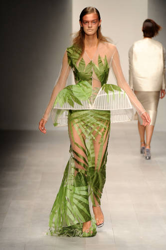
 i was finding it difficult to find designer references for my theme, so decided to type 'nature' into the WGSN search bar. it came up with this collection. i like how the print and the sheer contrast. i also like how they have carried on the leaf shape to bring in a different silhouette. the mix of sheer and pattern is one i enjoyed doing for my last 'Retro Swing' collection so think this might carry on to my next collection. the sheer is also more suited to the spring/ summer collection i will be designing as it is light weight and can be layered on top of or under.
 i found  this image on lookbook.nu. i thought it summed up quite well what i wanted the message of my collection to be. 
 as i said earlier, i want print to play a big part in this collection. i would like to use photographic imagery for the prints as i like the effect this gives. i also like the contrast of the black and the muted print gives, i could use this once my colour palette has been chosen to break up large areas of print.
 i love this photo. i think it embodies my collection. i have used it to go along with my customer profile story. i think it shows my customer is care free and appreciates beauty. i want the collection to be quite relaxed and girly as  i think that is what summer style is all about.
 i am quite interested in designing festival wear. i like how varied it can be, but the main focus is on being comfy yet stylish. i liked this photo because of the accessories they are all styled with and could think about incorporating them into my designs.
 as i was looking through WGSN, i found this collection. i like the use of bold print and think that the brighter greens contrasting to the white is a really effective contrast. white could be one of my main colours as it embodies summer and goes with every other colour while still looking fresh and crisp.
this photo i found on tumblr. i think is encapsulates the message of my collection as well as the earlier image from lookbook.nu. she looks relaxed but still like she cares what she wears.
 and finally, this reminded me of the photos i took which inspired this theme. i like how much brighter the lavender is compared to my photos. which got me thinking about different shades of the same colour, to build up a gentle colour palette.


Wednesday 2 January 2013

natures way?

so ive been thinking of ideas for my next collection and came across some photos i took last summer, which i find really interesting, different and quite inspiring! these are the photos i took:


i quite like the idea of using these photographs as prints and experimenting with print to bring out my 'natures way' theme. i have done some research on WGSN and found some other designers have used this kind of print to achieve really interesting results. i also need to think about what silhouette i want to achieve throughout each outfit, unless i leave it to my design process and see which silhouette suits my theme more.